


CSS Flexbox: Flexbox is a layout module. It is a powerful way of designing an efficient layout in CSS. It helps us to create a one-dimensional layout and provides much more flexibility and control over the layout design. It also allows us to put our elements in a row or column within our layout.
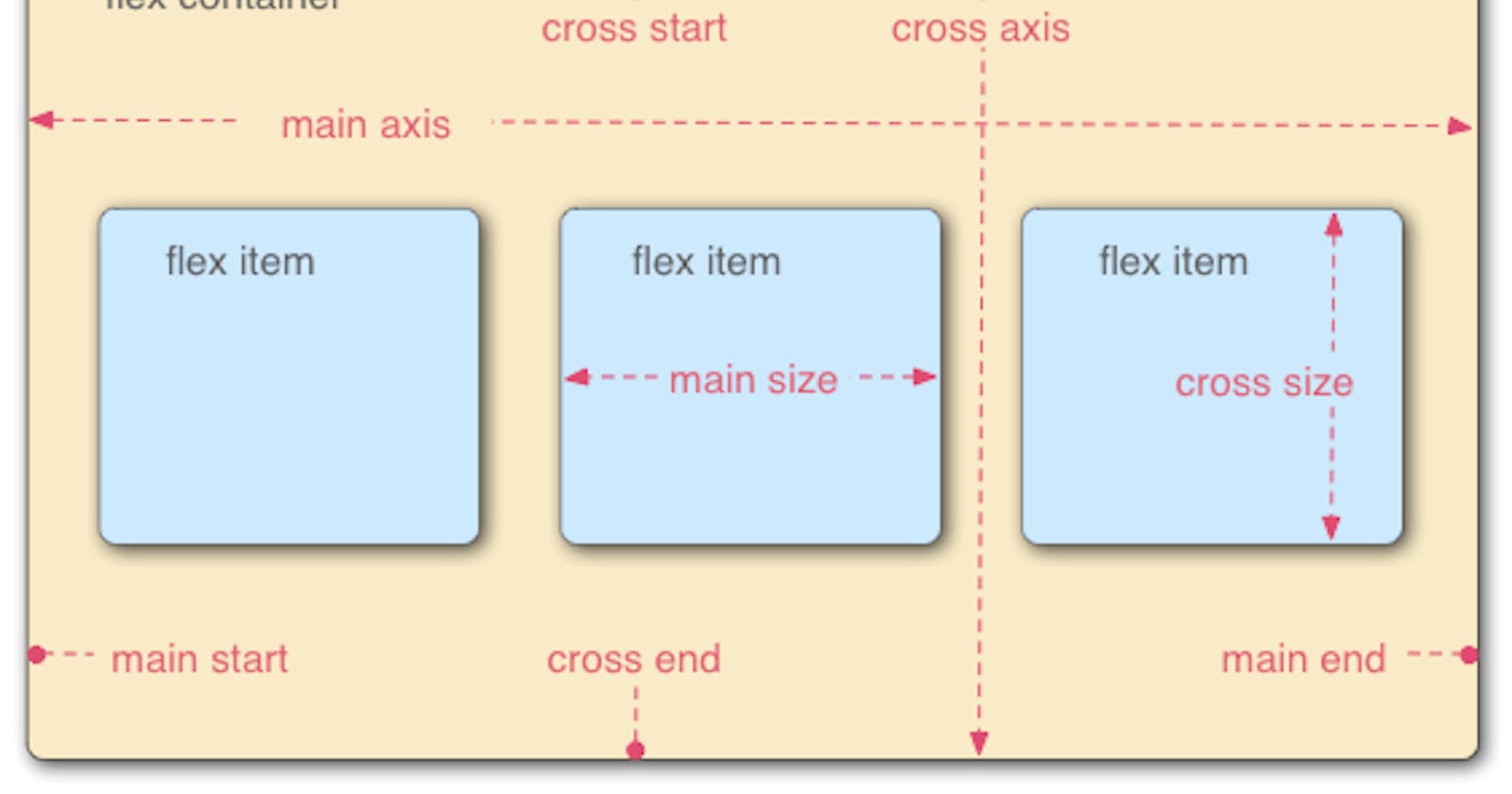
Some fundamental terminologies of flexbox:(1) Flex container (2) flex items (3) main axis (left to right and vice-versa) (4) cross-axis (top to bottom and vice-versa).
Flexbox provides a variety of properties to create layout efficiently. Generally, we can categorise the 'Flexbox' properties into two parts:
(1) Flex Container Properties:
(a)Display: display: block; display: inline; display: inline-block; display: flex; display: inline-flex; display: grid;
(b)Flex Direction: flex-direction: row; flex-direction: row-reverse; flex-direction: column; flex-direction: column-reverse;
(c)Flex Wrap:flex-wrap: nowrap; flex-wrap: wrap; flex-wrap: wrap-reverse;
(d)Flex-Flow:flex-flow: row; flex-flow: row-reverse; flex-flow: column; flex-flow: column-reverse;
(e)Justify-Content:justify-content: center; justify-content: start; justify-content: end; justify-content: flex-start; justify-content: flex-end; justify-content: left; justify-content: right;
(f) Align-items: align-items: normal; align-items: stretch;
(g) Align-Content:align-content: center; align-content: start; align-content: end; align-content: flex-start; align-content: flex-end;
(h) Gap:gap: 20px; gap: 1em; gap: 3vmin; gap: 0.5cm;
(2) Flex Items Properties:
(a) Order: The order CSS property sets the order to lay out an item in a flex or grid container. order: 5; order: -5;
(b) Flex-grow: CSS property that specifies how much a flex item should grow with respect to other flex items in a flex container. if a flex container has three flex items and one of them has a flex-grow value of 2, and the other two have a flex-grow value of 1, the first item will take up twice as much available space as the other two items combined. flex-grow: 3; flex-grow: 0.6;
(c) Flex-shrink: CSS property sets the flex shrink factor of a flex item. If the size of all flex items is larger than the flex container, items shrink to fit according to flex-shrink. flex-shrink: 2; flex-shrink: 0.6;
(d) Flex: It sets how a flex item will grow or shrink to fit the space available in its flex container. We can use flex in place of both properties 'flex-grow' and 'flex-shrink'.
(e) Align-self: This property is useful when you want to change the alignment of a single flex item within a flex container without affecting the other items. It can be particularly helpful when dealing with flex items of different sizes or with different content that needs to be aligned differently.