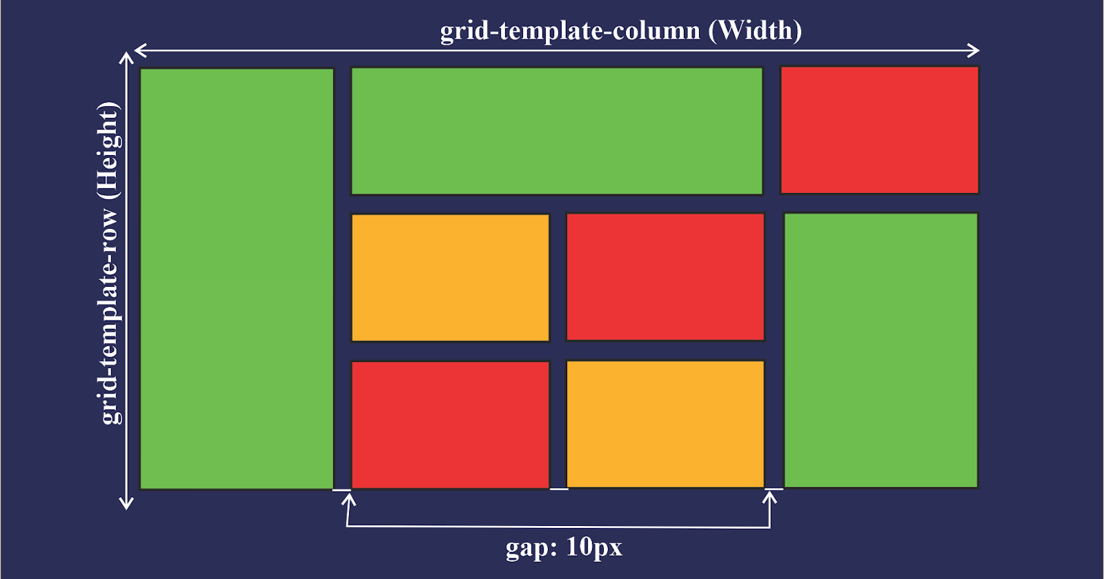
Grid in CSS: In CSS (Cascading Style Sheets), a grid is a layout system, that allows us to create complex, responsive web page layouts. It provides a way to divide a web page into rows and columns, allowing us to position and align elements within those grid areas.
The CSS Grid Layout Module, often referred to as CSS Grid, is a two-dimensional grid system. It allows us to define both rows and columns and specify how elements should be placed within those rows and columns.
Here are the key concepts of CSS Grid:
Grid Container: The parent element that holds the grid. It is usually a
<div>element or any other container element. We define it as a grid container by applying thedisplay: gridordisplay: inline-gridproperty to it.Grid Items: The child elements of the grid container that are placed within the grid. These items can be any HTML element.
Grid Lines: The horizontal and vertical lines that define the boundaries of rows and columns within the grid.
Grid Tracks: The spaces between grid lines that form rows and columns. We can specify the size of grid tracks using various units such as pixels, percentages, or fractions.
Grid Areas: The rectangular areas within the grid where grid items are placed. We can name these areas and assign items to them using the
grid-areaproperty.Grid Template: The combination of grid rows and columns. We can define the size and structure of the grid using properties like
grid-template-rows,grid-template-columns, andgrid-template-areas.Grid Placement: The positioning of grid items within the grid areas. We can control the placement of items using properties like
grid-row-start,grid-column-start,grid-row-end, andgrid-column-end.
Note: CSS Grid provides a powerful and flexible way to create responsive layouts without relying heavily on floats, positioning, or other hacks. It allows us to easily create grid-based designs that adapt to different screen sizes and orientations.

